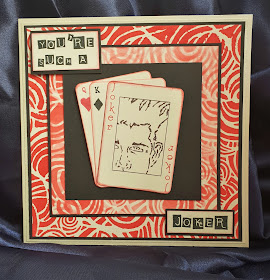
Morning friends & Crafters. Here's to a wonderful day for all of us. Touch wood, so far everything seems to be going really well, so it's a far cry from yesterday. Today I am sharing a fun card using my 'Media Medley' collection. I very rarely use red, but for this project I thought it would be the perfect colour, keeping it red and black matching the playing cards.
You Will Need:
Versafine Black Ink Pad
Candied Apple Distress Oxide Ink Pad
Black Fine Liner Pen
Centura Pearl 8 x 8 Card Blank
White Stamping Card 7 3/4" Square & 6" Square
Black Card 7 3/4'' Square Gutted with a 6 1/4" Square Die and then gut this with a 4 3/4" Square Die. This will provide all of your mats.
Tacky Glue
3D Glue Gel
Step 1: cut 3 cards using the ATC card die. Take one and mask off approximately 1/4" around the edge. Stamp Xander or your chosen face. Remove the mask and using a ruler and fine liner create a box around the design. Then use stamps to create the King & Queen playing cards. Edge all of the cards with the Candied Apple Distress Oxide.
Step 2: Take the smallest square of stamping card and stencil through. Rotate the stencil and repeat, this time using only the ink remaining on the stencil as you want this to be a lot paler than the first.
Step 3: With the larger piece, stencil through, this time only around the edge as this is all that will be seen. The colour on this layer will need to be strong.
Step 4: Mount your black card centrally and secure with Tacky glue and then add your next layer. Add your black mat behind this and then secure to your base card.
Step 5: To finish your card, add your black center panel. Then use some 3D Glue Gel to add the card topper. Stamp your sentiment onto white card, cut to size, edge with the same Oxide ink and mat onto black card. Secure these to your card using the Glue Gel.
For this project I decided to leave the face black & white. There are so many variations of this style of card. Why not use a different colour combination to give you a totally different look to suit.
One of the members of my Design Team (Natalie) coloured the Joker for one of her samples on the show, it really would make an amazing topper for a variation of this card.
Brilliant to be with you again today, I hope you have enjoyed the post today and that you will join me again very soon for some more inspiration. I hope you all have the most wonderful day. Take care and Happy Crafting.xx


Wow Nick, I do love this, just the difference of the paler fig of 8s and a stronger colour, gives such an amazing look. Love it. Take care X mo
ReplyDeleteOh Mo, thank you ever so much. Im so pleased you like the blog post, It's a subtle difference with the stencil but it really does give it another look totally.You take care too.xx
DeleteLike using the stencil twice with the paper image too,it gives a really different look. Love Natalie's Joker too. Nicola x
ReplyDeleteThanks Nicola, I didn't want both layers to be the same but wanted the same stencil. It's a great joker isn't it.xx
DeleteFab card! I do not care for red, but, perfect selection here. I like the lighter red then the stronger version. May need to rethink my color selections always go toward blues. As always a great blog with a wealthe of info!
ReplyDeleteThank you Carol, I am the same as you. I don't care much for red and very rarely use it but I will definitely try to use a larger palette rather than sticking to the blues as well. I am so pleased you value the blog. xxx
Delete