Pages

Sunday, 24 September 2017

Aurora Borealis

Hi, I am sharing the design I produced for the AALL and CREATE Challenge 5, The Americas. This has been inspired by my time in Alaska, such a wonderful place, with it's many different facets. While there I was lucky enough to see the Northern Lights. What I saw, will never be forgotten, it was truly magical. I wanted to capture the dancing lights in this artwork, using shades of green and yellow as well as put across the wow I felt at the time.

I wanted to include photos in my project, so after positioning them, I added my elements. The boxes would have the letters inside 'Alaska'. I also added the outline map of Alaska.

Next I added the letters using my mixed font stamp set from Clarity.

Using a ruler and a black Copic multiliner, I added lines to a selected point, to give the illusion that these were shooting from the page, this would be my extra large format feature.

I created a frame around the page, which would remain white on completion. Using Pebeo Drawing Gum I masked each element on the page.

I had a final mock up with the photos I had selected to work out my next steps.

I started with a landscape, using Blueprint Sketch, Chipped Sapphire and Black soot. This would have to be a lot darker than normal in order to achieve the results I wanted.

On the left hand side of my piece, I added splats of Drawing Gum to the mountain tops to suggest snow, before adding the mountains with distress inks. The colour here was lighter than the hills as I was stamping trees later and wanted it to appear as if light from the Aurora was shining from behind them.

Next I started the task of creating the 'Northern Lights', I had practiced multiple times to try to get the dancing effect rather than flat colour with many types of media. Eventually I chose to use Distress inks with shades of green, also adding blues and yellows, which gave further shades of green where they mixed.

I then started building up the dark sky behind, carefully trying to keep the ghostly effect, bringing the sky to life, as if it were dancing across the sky.

I then removed all of the drawing gum carefully.

Using alcohol markers I coloured my design. The outline of the map of Alaska was deeper, as I was covering that later. I also decided to leave the letterboxes white, so as not to detract from the sky.

Using Cosmic Shimmer glue, I covered Alaska with 'Ice Diamond' a Crushes Glass product, giving a frosty and sparkling appearance while allowing the colour to shine through.

Here is my finished piece.


Thank you ever so much for popping by to see my post today. I hope you like the finished piece, the photos along with the step by step. Take care and Happy Crafting.


Wednesday, 20 September 2017

Celebrate Diversity

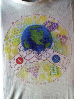
Hi everyone, Something new from me today, a craft that I have never tried before, I have really enjoyed it, so I can see that it might become an addiction. Here is my entry for the AALL  and CREATE Grand Finale, The World. As it's all about Celebrating Diversity, my thought was- why not wear it? Designing a tee shirt is something new to me, let along getting that design onto a wearable item. It's been such an enjoyable journey, taking part, so really wanted to leave my comfort zone.

To colour the base design, along with all the other elements I used the Colourist heat transfer paints. The entry and no entry signs will make more sense later.

I cut out my design (Mirror Image) to avoid an other marks being transferred to my project.

It was then placed face down and pressed with a very hot iron.


It was very exciting to uncover it, to see the result, I was very pleased.

On copier paper, I prepared the elements I wanted to use in the background, I used a selection of stencils and bubble wrap.These were set aside to dry.

The tricky part  was preparing all the words I wanted for the design. Each of them had to be done in reverse. It's a lot harder than you might think. I printed them off and used a light box to write them. The main circular design was to contain 'Celebrate Diversity' which I positioned within the circle. It was my way of symbolising connections.


Next using the same technique, I wrote the other words I needed. The positive words were placed within the arm containing the 'Entry' sign symbolising that these actions are acceptable. On the other hand the unacceptable action were added with the 'No Entry' sign.


Next, I built up my background layer by layer, using a mask from copier paper to keep the 'White Space' I ripped the elements I had created to ensure no hard lines. Layering from my lightest colour yellow, teal violet etc. It's a lot easier in papercraft, but thoroughly enjoyable.

This is my finished design. I didn't add any hole as in the brief as the garment has 4 holes already, neck,bottom and the two sleeves. 

I am quite sad that these challenges have now come to an end, It's been a great experience and it's been wonderful seeing all of the entries and the different takes on each challenge. I hope you like what I have done and the steps I have shared. Good luck to all.

Sunday, 17 September 2017

An African Mystery

Hi. I have another big project for you today, in fact the largest piece I have done to date about 60 x 40cm. It's my piece for the All-and-Create Africa Challenge No4. The first idea was an African landscape, which evolved as a result of research, elements I wanted to create and a story. There are a lot of elements all of which, tell just one version of a mans journey. So what's the story surrounding this mans life? Was he part of the Trans-Saharan gold trade, providing gold to the Mediterranean economies that demanded it. The man was unearthed at the foothills near to the Sahara Desert. Among his possessions were some trade beads, traced back to Ghana, threaded onto copper wire. Whats your version of his story?  

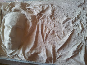
To start with I created his face using a polystyrene head and allginate. This was filled with plaster, I made the mould to one side rather than face on.

The face was secured to my board. Then using polystyrene, I created the high and low points to start the land.

Using Ivory Powertex and Calico I began building the landscape, creating Mountains,hills,valleys and delta's.


The next layer was sand to create the ground, here i used a selection of fine and medium sand. Then added more layers of a texture paste in certain areas which gives another interesting texture, completely different to the sand.


To add pictorial interest to my piece and tie in with the story and theme, I create a landscape within a map of Africa. I made a stencil with copier paper and then used distress inks.

Then it was back to the main piece, building up various layers of colour from pale creams, yellows through to oranges and reds, leaving each to dry before moving on to the next. 


The final stage of the landscape was to create even more dimension, texture and colour. I decided to use rust, with it's lovely rich but sometimes unpredictable colours, which was scary. I went back to this many times with vinegar, brushing and moving it around to get the effect I wanted. Here is a photo of part of the process. It's looking a little disastrous and close to going in the bin.I was constantly worrying, wondering whether all the work so far had been wasted.

This project was a great learning process for me. I had loved geography and studied (minimally) parts of Africa in secondary school. This time round I read about the trading beads and found photos of some from Ghana. I wanted to make some and include them as an element in the finished piece. First I rolled out some paper clay into thin sausages and left to dry.

Next, I painted them with matt black gesso.

I then painted the 3 thin lines with yellow ochre.


To add the design, I used a white 4Artist marker from Pebeo.

Colouring the face came next, I had already built up the colour as I did the landscape, but now needed to tie it in with the background, I used layers of burnt umber, black and reds, distressing these as I went to get the finished result.

The first layer of rust was finally finished, I was extremely happy with the effect and wonderful colours it had given.


I layered up my pictorial element onto black card, drew in a double black line to create a frame and stamped using a mixed font from Clarity.

Meanwhile I added more rust and texture around the face to ensure it appeared as part of the landscape rather than just stuck in.I wanted it too look like it was coming 'OUT OF AFRICA'


Thank you for stopping by today and taking a look at this project. I hope you like all of the photos, the close ups really show the detail off, much of which is impossible to see without seeing it in real life. Take care and Happy Crafting.