Pages

Saturday, 30 April 2016

Art Wall Hanging Brush Holder

Morning, This was a really fun piece to make and it's really useful too. It's great to hang up in your craft room to hold your brushes, pens or pencils. You could even add other pockets, depending on what you want it to hold. 


The paints I used were from Indigo Blu, They are extremely concentrated and give marvellous results on fabric as well as other mediums. I used the 'Art' stencil in various sizes, using a stencil brush, I stencilled onto calico, cut out the words when dry and set aside.


The base of the hanging is made from a large piece of medical gauze, this takes inks and colour extremely well. I folded this into the shape I wanted and sprayed with Orange and Purple ink sprays.

Using a smaller piece of calico, I stamped a selection of stamps from the 'Arrow to the Art' set from Leonie Pujol with a Versafine ink pad. I cut these out when dry and again set them aside.

When the base was dry, I started stitching around the edges using my Toyota Oekaki machine. Then using the free motion, I embroidered around the stamped calico shapes onto the base. Before stitching the words in place, I added some different materials and an old dictionary page to add texture and dimension. Finally I added a plain calico pocket to hold the brushes. The hanging part was made by adding a coloured pencil to the top and gold coloured jewellery wire.


Thank you so much for visiting today and taking the time to look around. I would love to hear your comments. It's great to hear what you think. I have some other thigs to share over the next few days, so the next post using Leonie's collection will be on May 5th. Take care and see you soon. xx

Friday, 29 April 2016

Home Birds Project

I cant quite believe we are nearly into May, this year seems to be flying by. Today I am sharing another project I have made using Leonie Pujol's Collection. I know I have said this before, but they really have been a pleasure to work with and the ideas do keep coming. I really hope you have enjoyed seeing the projects I have made.


For this project I thought it would be nice to add another stamp to the design and I have chosen a beautiful Clarity Stamp, The House-martin, Although by using different colours I have created a couple of fantasy breeds. I have also used Leonie's home mask and a selection of stamps from her collection.


I started the project by placing the home mask in the area I wanted and stamping the birds. I wanted the birds to be slightly off my main design. Secondly I planned and mask off my design area with washi tape and copier paper.

Next I stamped the large flower stamps and masked them off, I used cut outs first, but just lately I have come to the decision that I prefer Pebeo drawing gum. I wish I had used that in the first place. Especially on this project as I wanted to use blending tools for the Distress inks and the cut out do tend to need repositioning then.


I then stamped all of the fillerinerus (as Leonie calls them). Using Shaded Lilac Distress ink I blended the centre of my design across the Home mask, The from the outside in towards the home I used Adirondack Stonewashed. I repeated this with Blueprint sketch and stopped about halfway and finally repeated just around the edges with Chipped Sapphire, concentrating more around the stamped corners.

After removing all of the masks, I coloured in the elements using a selection of my alcohol markers. Then, I cut around the edge of my design with a craft knife and ruler, avoiding the overhanging wings and layers onto black card and then onto dark blue.


Hopefully, you have enjoyed this post and I really hope you like what I have done here. Thank you so much for taking the time to visit my blog. Thanks for all of your comments, I am over the moon to get them. 

Thursday, 28 April 2016

Wedding Joy Mount Board Hanging

This wedding joy hanging is made with a photo from My Nan's wedding. I copied it as I didn't want to spoil the original. The best way for me to explain this project is to break it down into individual elements.


From Leonies' collection I used stamps from the Doodle Drop set, the Joy stencil and the Love stencil. The distress inks I have used for this: Antique Linen, Old Paper, Pumice Stone,Vintage Photo,Victorian Velvet,Tattered Rose & Worn Lipstick. For this project I also needed a piece of mount board,regular tissue paper,Gilding Mega Flake,Fleather,Seam Binding and some Garden String.

Firstly I embossed the Joy stencil 4 times onto scrap card-stock, cut each one out and stuck them together using Stick and Stay and then glued to the mount-board. I then painted the entire surface of the mount-board and joy with lightly watered down gesso. While this was still wet I covered the whole piece with tissue paper and manipulated it to create creases all over.

Using some Faux leather made with kraft card, I cut out the tag along with some various shaped flowers, I used the complete Orange Blossoms from Sue Wilson. The remainder of the faux leather was used for a matt for the photograph. I used the love stencil (second size up) as a mask on the tag, stamped the solid hearts all over the tag in black and then used walnut stain distress ink and threaded with garden string. I stamped the flower die cuts with the flower stamp and stuck together using Cosmic Shimmer Glue.


I tore around the photo, then aged it using a selection of the distress inks & blending tools. Covered in Versamark and Ultra Thick Embossing Powder and heated with a heat tool. I repeated this twice more to give a really think covering before putting it into the freezer for 10 minutes. When it came out I created the crack and rubbed in Walnut stain to enhance the cracks.


On my craft mat, I tapped the distress inks: Antique Linen,Tattered Rose, Victorian Velvet and a very small amount of Worn Lipstick. Spritzed with water and rubbed my seam binding into it. Then dried with my heat gun, whiles crunching it to make it look really aged.


On the background board, I stamped the hanging heart with flitterglu and covered with Mega Flake from Indigo Blu. Then I took a damp sea sponge and added flitterglu here and there, around the edges as well as over the 'Joy' and covered with the same Mega Flake, then rubbed of the excess with a scootchy.

The final stage was to colour up the white background with a selection of Distress inks. I also highlighted the creases with darker inks and all around the project. Then assembled as shown in the finished photo.


Hopefully, you have enjoyed this post. I really enjoyed making it and sharing it with you. Take care and Bye for now and see you soon. xxx


Wednesday, 27 April 2016

Art Deco Inspired Acetate Card

Morning, Thank you so much for your support and for the lovely messages. I really do love getting them and it makes me very happy that you are liking the things I am sharing and enjoy seeing what I have made.


This is actually the very first card I made when the new collection of stamps and stencils arrived from Leonie Pujol. I had the idea of using a stencil surrounded by just one stamp. At the same time I wanted the stencil part of it to be hidden until the card was opened. I played around with various ideas (most of them disastrous) until I came up with the plan that ended up as the finished card. I decided to use an Art Deco type shape at the front, with a representation of a sunset behind. Working out how and which stamps would work for this design was the hardest task.


The base card was 8 1/4 x 8 1/4, I drew my design using a pencil and ruler onto the front of the  card, then using a craft knife removed the excess. To mask of the sections I used washi tape. When the stamping was complete, I darkened  the design lines with a black fine liner pen and coloured using alcohol markers, black and 3 other colours. I wanted the front design to act as a contrast to the bright colours of the backdrop.


For the inside, I worked out the positioning of the stencil so that it would be hidden from view until the  card was opened. The positioned the circle to fit whether the card was open or shut. There were a lot of masks needed for the inside design, to avoid any over-stamping, but I definitely think it was worth it in the end.


The sunset was coloured using a selection of red & red/orange alcohol markers to give depth and dimension. The card was finished using one of Bev's stamps from BeeCrafty. I love her stamps and the sentiments are amazing. I attached acetate to the front of the card, then used a plainer version of the front to hide the tape used in construction.


I hope you like the finished card. Thank you so much for taking the time to view my blog. It does mean a great deal to me. Crafty Hugs Nick xxx

Tuesday, 26 April 2016

Artist Trading Card Selection


Morning, thanks for stopping by again. Yesterday I showed the ATC holder that I made for the launch of the new stamp collection by Leonie Pujol. Today I have a selection of cards I made to go inside. I hope you enjoy.
Mrs Peypes' New Gown:

To create the background I used multiple cut outs from the 1849 Edition of 'The Illustrated London News'. When dry, I coloured the dress using 3 shades of green alcohol markers, I used distress ink around the edges of the card, Peeled Paint, Twisted Citron and Mowed Lawn. On a separate piece of  super smooth card I created the centre of the flower using a stamp from the Branching Out Set and the petals using a stamp from the Arrow to the Art set. I used a mask for both of these so I could cleanly overlap the stamps. I then coloured the flower with a selection of alcohol markers, decided on the area and stuck it to my card.

London Fireworks:

To create the foreground, I fussy cut the scene I wanted and stuck it to my card with Cosmic Shimmer Glue. I used Pebeo Drawing Gum on the areas I wanted to keep untouched, St Pauls, The River, Flags and the people watching. The i took stamps from Inky Notes set,Feathery Flourish set and Arrow to the Art set. I then stamped these in the sky using a selection of bright distress inks, over-stamped them with Versamark, covered with clear embossing powder and used a heat tool to set.

Using Chipped Sapphire, Blueprint Sketch and Weathered Wood Distress inks, I blended the night sky fading to my focal point. I also used the same to add colour around the edge of my card. inally I removed the gum and added a few highlights using Squeezed Lemonade and a watercolour brush (Hardly and Water).

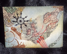
Old World Map ATC:

I used the old world map decoupage papers from Craft Consortium to create the background for this piece. I tore the areas I wanted and glued them using Creative Expressions Matt Glue Seal & Glaze. To age the rest of the background I used Weathered Wood,Tattered Rose,Old Paper and a smidge of Squeezed Lemonade so it blended with the old map. An Indigo Blu stamp (from Ink Splats collection) was stamped with Archival coffee Ink.

I created the compass using a stamp from Leonie's Arrow to the Art set. The arrows I added also came from the same set. From the Feathery Flourish set I added the direction lines on the map. Finally I added the compass points using a mapping pen and Gold drawing ink.


Monday, 25 April 2016

ATC Holder With Button Embellishment

The more I played with Leonie Pujols' New Collection, the more ideas I came up with. They really are valuable to have in your stash. I've not even started using them to create backgrounds yet, I just know they are going to become a go to item.

I love making ATC's, so decided to make this handy little holder with pockets. There is a brilliant tutorial in the book that comes with the Eazi Score Craft Board 'Inside Secrets of a scoreboard' by Diamond Card Craft.


I made all the separate parts and decorated it before assembling it, making it far easier to stamp and colour. You can make any design you like as there are so many great stamps for pattern building in the collection and they all mix together perfectly.


I coloured the finished design with alcohol markers and added glossy accents to the hearts. I also made a button embellishment for the closing flap, using the Epiphany tool and a 25mm round bubble cap. I simply chose my stamp from the Branching Out set and coloured with my Alcohol markers.


When everything was dry I assembled the folder adding ribbon for the closure, which I also re coloured using alcohol markers.

Sunday, 24 April 2016

Rose in the Moonlight

Hello again.

For this card I used a selection of Stamps from Leonie Pujols' new launch. I also used a sentiment stamp by Sheena Douglas. Blueprint Sketch,Weathered Wood and Chipped Sapphire Distress Inks. A selection of blue alcohol markers as well as a couple of greens and a Sharpie white fine liner pen. To cut the design I used a Tonic Circular Die.

I really loved making this card and I love the colours in the moonlight. I won't go into great detail with regard to the masking as I detailed it in the Parchment card earlier in the week and I don't want to bore you. Below is a photo of the mask I made of the image I wanted to use. You could use Drawing Gum, but if you do make sure your are careful with the ink residue from stamping when rubbing off the gum. I decided to use the paper as it's faster for this size and type of design.


When choosing the stamps to use, I tried to bear in mind the petals that would be darker or lighter and used stamps to reflect that. When the stamping was complete, I used my alcohol markers to add colour and depth to the flower and stem.

For cutting out I used the out of the box technique with a Tonic die. Then using my selection of distress inks I blended around the moon shape and using a mask blended away from the flower.

Finally I used foam tape to attach it to black card. I used an inverted corner punch around the edge of the black card. The I layered it onto blue card, I used a different corner punch on the blue card. Lastly I added some stars in the sky using the white fine liner.


Thank you so much for taking the time to read my blog & I hope you will come back again.Nick xx


Saturday, 23 April 2016

A new Art Journal

Hello just an extra share this morning. I love making these art journals and over the last couple of days I have made another, so here it is. I have made it with completely recycled materials. I use backing board from envelopes for the cover, even the signatures inside are made from card and papers that were slightly damaged around the edges. They were cut down to make them the perfect size for the journal.


I used the faux leather technique and then embossed with a rose embossing folder on the from and back cover, When this was dry I used Aged Mahogany to colour the roses roughly before using a mixture of distress inks to create the leather look. When this was dry I added protection using mod podge.

I've not listed the whole process as I posted a step by step in March. If you would like to see how, click here.

I am adding this to the Sisterhood of Snarky Stamps: 57 -E is for Embossing Challenge.

Sepia/Brown Illusion Coaster project

Here's another of the projects I made using stamps from the new Leonie Pujol range. 

To prepare the MDF coaster, I gave it tow coats of white gesso. When it was dry I marked out the first line of my edge border lightly in pencil, I have made it slightly darker here so it shows up a little better.


Next I added my first bars with a ruler and fine liner (05) in sepia.


Then I marked out my second line for the edge border in pencil, followed by some more bars using the ruler and fine liner. The more bars you add, the greater the dimension as it creates the illusion of depth. It's worth bearing in mind though that the more you add, the more spaces that are created to fill with stamps. You want to try and leave some larger spaces so the stamp designs stand out.

I started adding the bars I wanted to appear closest and then worked backwards. Careful not to go over any lines.


Time to mask and and stamp the edge and bars ready to stamp. I used washi tape for the edge and Pebeo drawing gum for the bars.


When It was dry I selected the stamp I wanted and filled the space between to form the border.


After removing the tape and gum, I used the straight edge of copier paper to mask off the other areas for stamping until the design was complete.


When I finished the stamping I took the sepia fine liner and drew a deckled edge around both sides of the border avoiding crossing any lines.


Then it was just a case of adding shading to the design with either alcohol markers or pencils and varnishing with an appropriate sealer depending on which medium you have used. I used crafters companion Spray and Shine.

Friday, 22 April 2016

Misty Morning Scarecrow

It was very misty this morning, the sky was the most beautiful shades of blue and the mist was sitting in the pockets of the land. I have tried to show that in this card I made for the Monthly Clarity Challenge blog.

I used the Scarecrow as my main image and wanted it to appear that he was coming out of the card. I started by stamping him onto my base card and onto a piece of copier paper to act as a mask. Then layered masks over him to create the frame, sunrise, and hills. Using a Clarity Countryside Stencil, a clarity moon mask, a clarity landscape mask and so torn copier paper.

For the landscape I used, Bundled Sage and Mowed Lawn Distress Inks. For the Sky I used Adirondack Cloudy Blue and Stonewashed. For the sun I used Mustard Seed and Spiced Marmalade Distress Inks.

I then removed the Stencil and replaced it with the Countryside mask (inner) and masked my frame with washi tape. I offset the mask slightly to achieve a slightly 3D look and continue the misty feel. I blended away from my mask first and then blended off from the frame using Blueprint Sketch distress ink,

The frame was deckled using a black fine line marker and the space between coloured with my alcohol markers. I then removed the mask and coloured the scarecrow using my Alcohol markers. I cut out the frame using a craft knife and ruler, and finished by cutting around the parts of the scarecrow that extended past the frame.

Finally I layered this onto white cardstock then onto a black pearl card.

I am entering this card into the Clarity Blog Challenge Number 38 

StampBord With Silver Clay

The inspiration for this project came about because of the builders that were here. They used to hang their lunch bags in the tree outside the window. One evening a bag was left in the tree. It was just a coincidence that the moon was full that night. The whole of the tree was lit up by the moonlight and the bag was really shining. 

For this project I have used:
A white Sharpie extra fine point liner.
Black Archival ink pad
Distress inks: Blueprint Sketch, Dusty Concorde, Chipped Sapphire and Black Soot.
I used Stampbord, stamping the tree first using the branch. I used the edge of some copier paper to mask of when adding the branches. The branch bends really well, so you can get some great results, it doesn't look the same when you repeat the branch.


Then I stamped the row of flowers, I love this stamp, It reminds me of the Thrift plant used on the Brass Thrupenny bit. It's got a real Art Deco look about it and inspired another card (to come).

I masked the flower heads with Pebeo drawing gum and allowed it to dry. I purposely left a small gap at the bottom, but you could quite easily line the stamp up with the edge if you wanted to. I used Versamark to stamp the moon and used clear embossing powder over the top. I did use an anti static bag as well to avoid unwanted areas of clear.

Then with a blending tool I built up a layer of Blueprint Sketch, gradually lighter towards the focal point. Using the same technique I added Dusty Concorde and Chipped Sapphire to create a dark to light blend. Finally just around the edge I blended in some Black Soot, very lightly with very little on the pad.

Using a scrapping tool, I added the highlights to the tree. This was done twice, the first time I added a suggestion of Blueprint Sketch and the second was left white for added dimension.


The pendant hanging from the tree was made using silver clay, the pattern was added using the stamp from Tangled Tails. These are great stamps to use with the silver clay.


Finally, I removed the drawing gum from the flowers and again used Blueprint Sketch to add a 3D look and a scraping tool to add highlights to the black flowers. The added a few stars with the Sharpie pen.


Thursday, 21 April 2016

Let's Go Fly a Kite

Something completely different using just two of Leonie's new stamps, the Kites from The Tangled Tails set and the Branch from The Branching Out set from Leonie Pujol. I found the branch particularly useful as It bends really well giving lots of scope for trees etc. The sentiment on this card is from the Fanciful Phrases collection from Creative Expressions.


After deciding on the size of the image, I made a box frame by taking a sheet of Centura Pearl and adding a 3/4''measurement to each side. Then using my big score board scored at 1/4'' and 3/4''. This gives the frame a 1/2'' depth and leaves 1/4 to attach to the base card. I then used an oval die to create the aperture.

Firstly, I stamped the kites in the area I wanted them in and masked them off using Pebeo Drawing Gum and leaving it to dry naturally. Then I created the landscape using some torn paper, I used 3 distress ink pads for this: Peeled Paint, Mowed Lawn and Forest Moss applied with cut n dry.

I then masked of some clouds made with torn paper and used Adirondack Cloudy Blue and Stonewashed for the sky. The tree branches were stamped in Coffee Archival, the foliage was made using the same distress inks as the grass with the addition of Pine Needles.

After colouring the kites, I attached embroidery thread to the kites by making a hole and threading through the holes to the back of the card. The oval Background was  then stuck onto my base card, Blue Centura Pearl from the Brights selection from Crafters Companion. I used acetate in the aperture so before securing it, I made a hole for the kite tails to come through to the front. For the kite handle I used 3/4'' of paintbrush and glued it while winding it onto the handle.


I have entered this card into the Penny Black April Birthdays Challenge.

I have entered this card into the Country View Crafts April Spring Challenge. Flying a kite on a mild spring day.

Wednesday, 20 April 2016

Parchment Zentangle

For this card I decided to create a Parchment design using Zentangle. Leonie's new stamps are fantastic for this, the sky is the limit when it comes to different ways to use them. Across the collection there are many possibilities to be creative.
Firstly, I chose a design that I wanted to use. It's best to pick and open design or stamp for this to give you room to play with the design. For this you will also need a mask for the inside and outside of the design to allow multiple pattern stamps to be used.

I traced my design onto parchment using a mapping pen and the same design onto copier paper, this will act as your masks. The outside mask will stay in place throughout the project until the stamping is complete.For each section of stamping I just removed the particular segment from the inside mask and replaced them as needed. For the stamping I used a white stayzon ink pad.


When I had completed all of the stamping I removed the remaining masks. Then I created a square frame around the design. It's easy to mask this off and I used low tack tape while I stamped all the way around the inside of the frame. I used a mask of the stamp I used so I could overlap the stamps without causing any crossed lines.I used a ball tools to produce the white work and add shading where I wanted. You don't have to do this, you can just retrace your design using a small ball tool and a soft mat.

To finish, I shaded the back of the parchment with black. You can use black pencils or Alcohol markers, whatever your particular preference. I chose black but any colour would work well. I used a corner punch to attach to black pearl card and layered onto Centura Pearl Snow White from Crafters Companion.